The sensation
Crunch.
The sound, texture and pleasure at the heart of the product. Immediate, familiar and easy to remember.


Naming, positioning, identity and packaging for the launch of a gourmet popcorn brand. A complete brand, built around the pleasure of a good crunch.

Brand strategy, naming and identity.
Product nomenclature, packaging and launch communication.
Brand naming
The brief was to launch a gourmet popcorn brand. We named it The Crunch Box: a simple expression of the product and the experience. A box full of crunchy popcorn, with a name that makes you want to open it.
The sensation
The sound, texture and pleasure at the heart of the product. Immediate, familiar and easy to remember.
The promise
Something full of good things. A name that puts the experience of opening, choosing and sharing into the brand itself.
Positioning & messaging
The brand brings a gourmet sensibility to popcorn without losing its playfulness. Flavour, texture and the pleasure of eating lead the story, not complicated language about what makes a snack premium.
The closest thing
to pure love in a box.
The brand promise keeps the focus on enjoyment. Warm, expressive language gives the products personality and makes the box feel like a treat, whether it is for you or someone else.
Visual identity
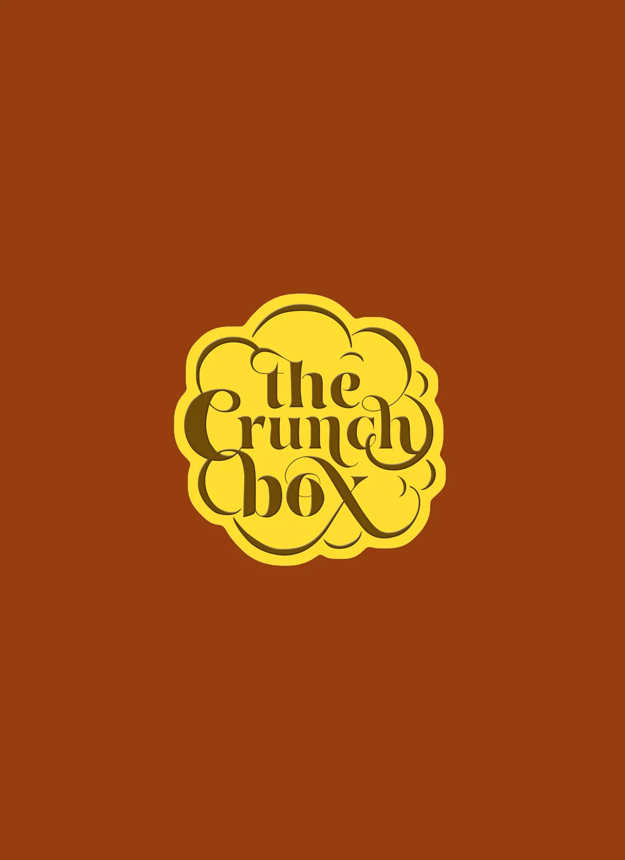
The lettering is shaped like popcorn itself. Curving, overlapping letterforms come together as one full, rounded mark, creating an identity that looks like the product before you read the name.
The letters sit closely together, with generous curves and expressive flourishes. The result feels full of character, rather than like a conventional label placed on a snack.
The yellow signature ties the range together. Purple, orange and yellow packaging, with distinct patterns, give the different products their own expression.
Product nomenclature
We created the product naming system as part of the same verbal identity. Each name brings flavour and sensation together, making the range descriptive without losing its personality.
A familiar flavour, with a playful finish. The name keeps the savoury character clear and the tone unmistakably light.
Warmth, sweetness and texture in one name. It tells you what to look forward to before the first handful.
Packaging system
The packaging carries the personality into the product range. A shared logo and bold colour keep the family connected, while geometric patterns and small illustrations give each tin its own presence.
The popcorn-shaped mark anchors each pack. Colour and pattern provide variety without breaking the system. In the larger box, the window brings the range together and lets the products do the talking.
Launch communication
Product creatives and printed launch materials extend the same appetite-led identity. Flavour names, product imagery and a warm invitation to try the range give the new brand a consistent first impression.
The menu pairs names with product images, making it easy to explore the flavours and find something to try.
The same lettering, colour and playful voice connect the launch materials to the packaging. One brand, from the first introduction to the box in your hands.
The Crunch Box × ENG1N