Website design / Case study
← All case studiesGentari / Website design
A cleaner future.
A clearer way in.
Clean energy is a connected world. The Gentari website brings that world into view, from the larger ambition to the everyday choices that put it into action.
CONNECTED.
IN ACTION.↗Visit Gentari

01 / The ambition
Big ambition.
Not a bigger maze.
An energy business can speak to companies, drivers and people exploring a cleaner future, all at once. The challenge was to give each audience a way in while keeping the wider Gentari proposition connected.

The thinking
One world.
Different ways in.
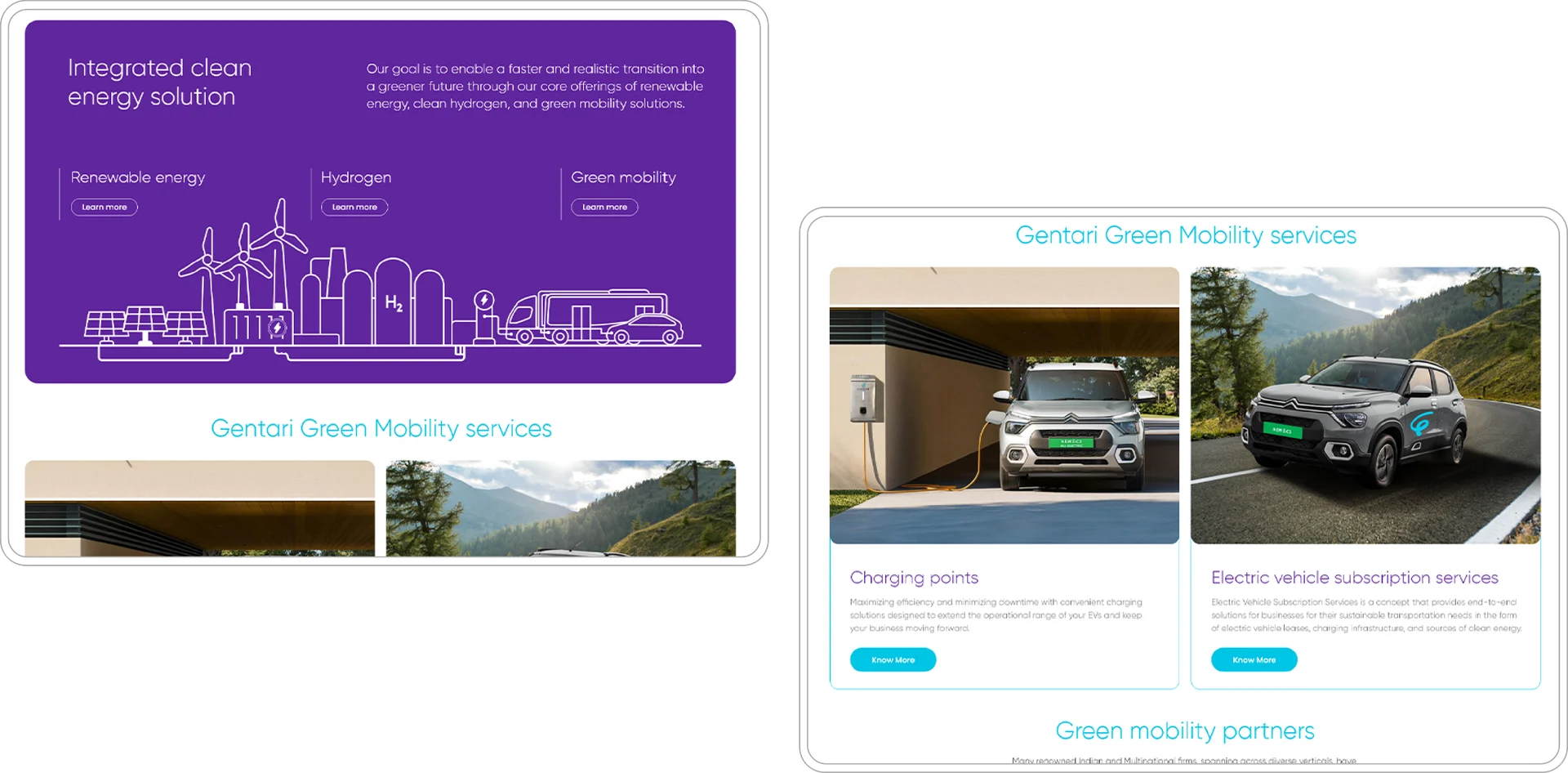
Green mobility, charging and electric-vehicle services sit within the same visual world. Distinct sections give each offer its own space, without making the website feel like separate businesses.
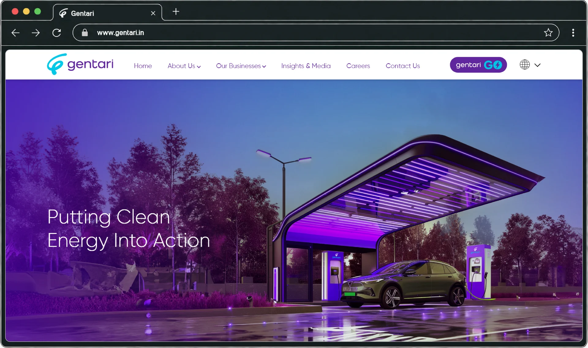
The teal and purple palette keeps the brand recognisable from the opening screen onwards.
02 / The website
Keep the energy.
Lose the noise.
Large imagery, generous space and a clear sequence turn an expansive proposition into something people can explore. Brand purpose, individual services and the Gentari Go offer each have a role in the journey.
Make the ambition
visible.
A consistent colour system and distinctive imagery connect the company story with its services.
Give each route
a purpose.
Charging, vehicle services and business solutions have room to explain what they mean for their audience.
Connect the idea
with action.
Service information and Gentari Go introductions create routes beyond the opening brand statement.

03 / The mobile experience
Smaller screen.
Same presence.
Colour, imagery and section hierarchy carry the experience onto mobile. The mobile experience keeps every screen within the Gentari story, from clean energy to the EV advantage.


From a big idea
to a useful next step.
A connected digital expression of clean energy, with a clearer way for people to find their place in it.