Skip to case study
ENG1N

Website design / Case study

All website case studies

NASSCOM Foundation / Website design

Technology.
With people at its centre.

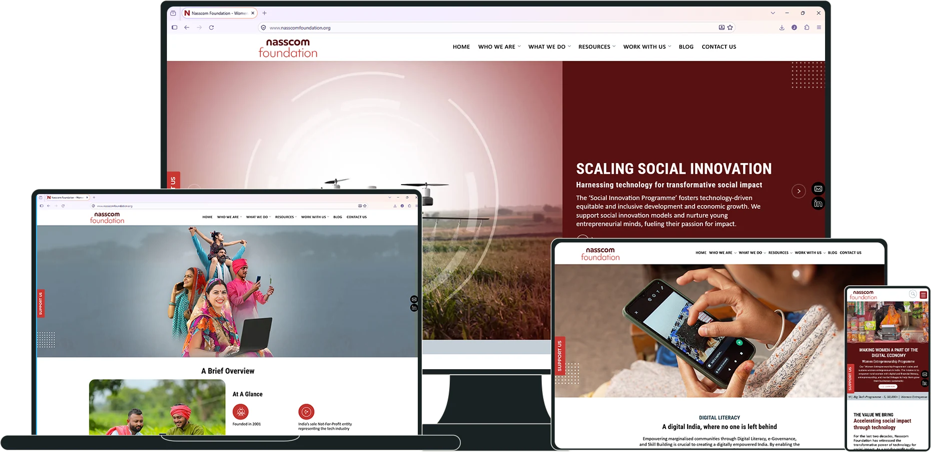
A responsive website presentation connecting the organisation’s impact, programmes and ways to participate.

TECHNOLOGY.
FOR PEOPLE.
Explore the website
NASSCOM Foundation website presented on desktop, laptop, tablet and mobile screens
NASSCOM FOUNDATION / WEBSITE DESIGNSelect a static image to view it larger.

01 / The challenge

Give the story
a clear hierarchy.

The homepage design moves from the opening proposition into programme areas, impact stories, partners, news and contact. The case focuses on those visible design decisions.
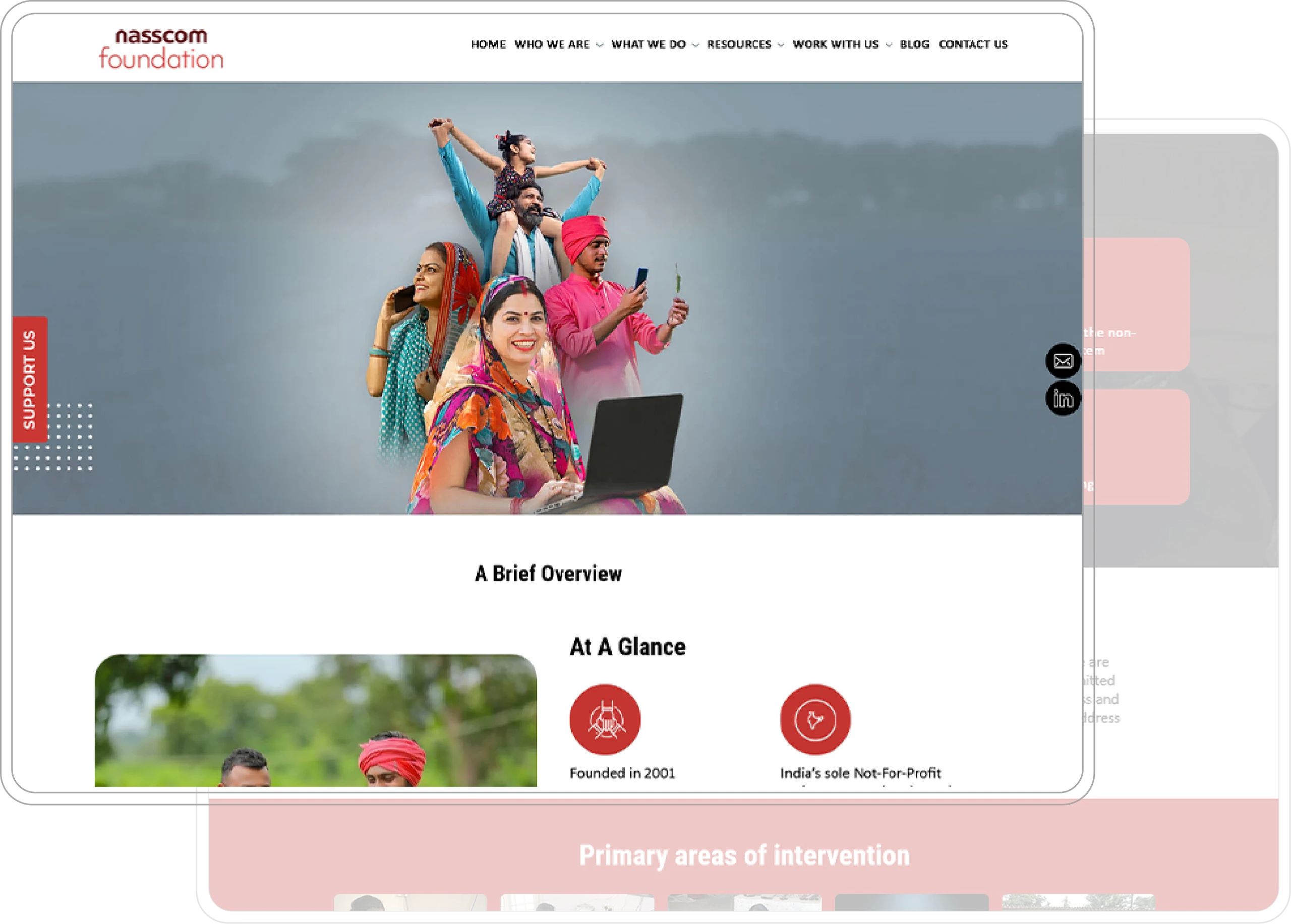
NASSCOM Foundation About Us page with participant photography and an organisational overview
The wider picture / Organisation, purpose and areas of work.

The thinking

Put people first.
Make the programmes clear.

Photography gives the work a human starting point. Programme pages connect that introduction with the people, activities and information behind each area of work.

Red panels, open white space and a consistent content hierarchy bring structure to a wide range of programme and organisational information.

02 / The website

The work.
The people.
The ways to participate.

From the opening proposition, the website moves into programme areas, participant stories, partners and opportunities to get involved. The structure keeps the wider purpose connected with the detail.

NASSCOM Foundation homepage with community photography, a digitally empowering communities introduction and a red content panel
The opening / Technology shown through the people it reaches.
01 / The structure

One structure.
Many areas of work.

Organisation, programmes, resources and participation routes sit within one clear navigation system.

02 / The character

Let the people
lead the story.

Community photography, participant stories and familiar page patterns connect different areas of work.

03 / The next step

Make participation
easy to find.

Volunteering, partnerships and contact information sit alongside the programmes visitors are exploring.
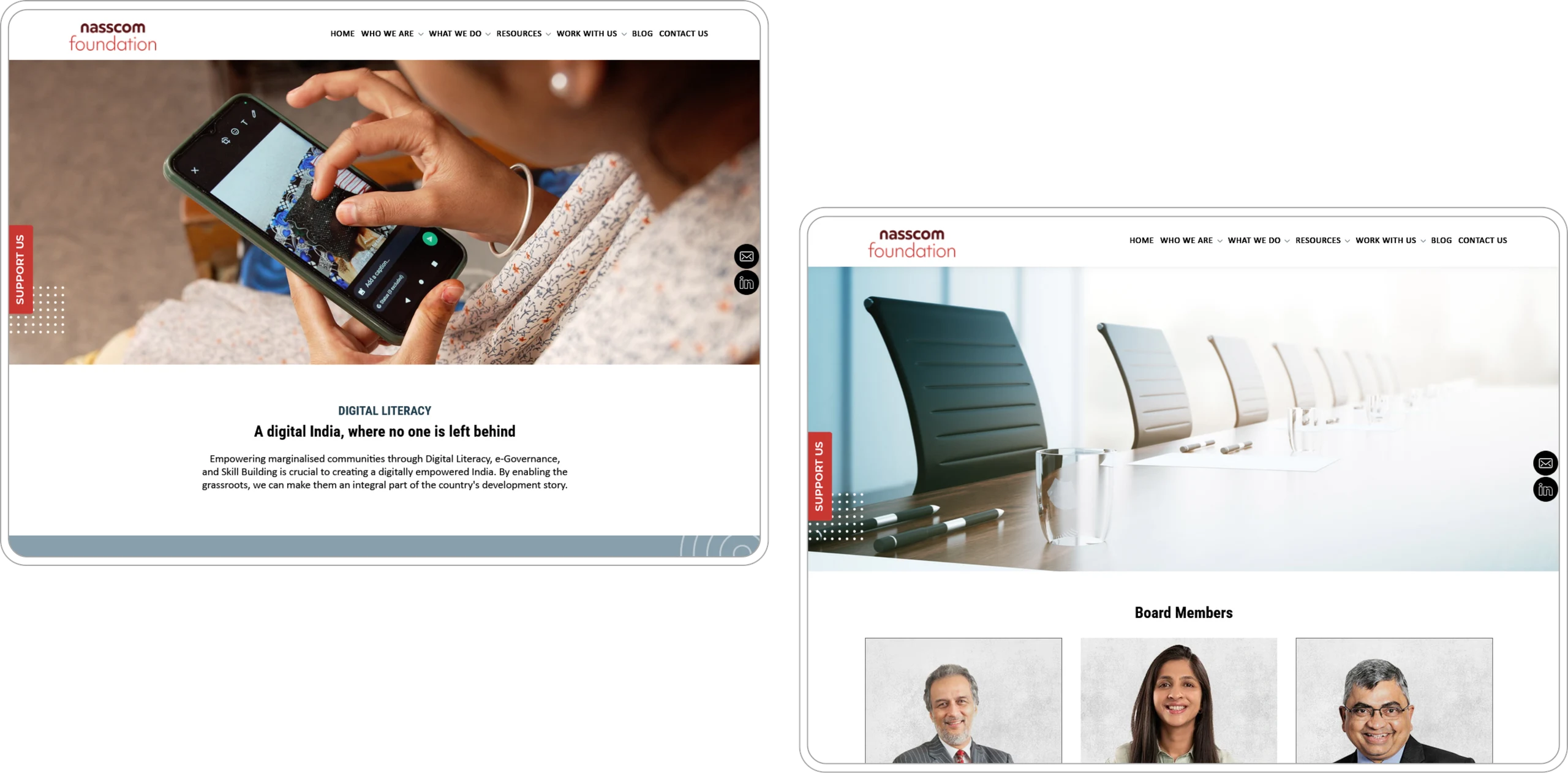
NASSCOM Foundation digital-literacy and board-member website compositions
The organisation / Connecting the work with the people behind it.
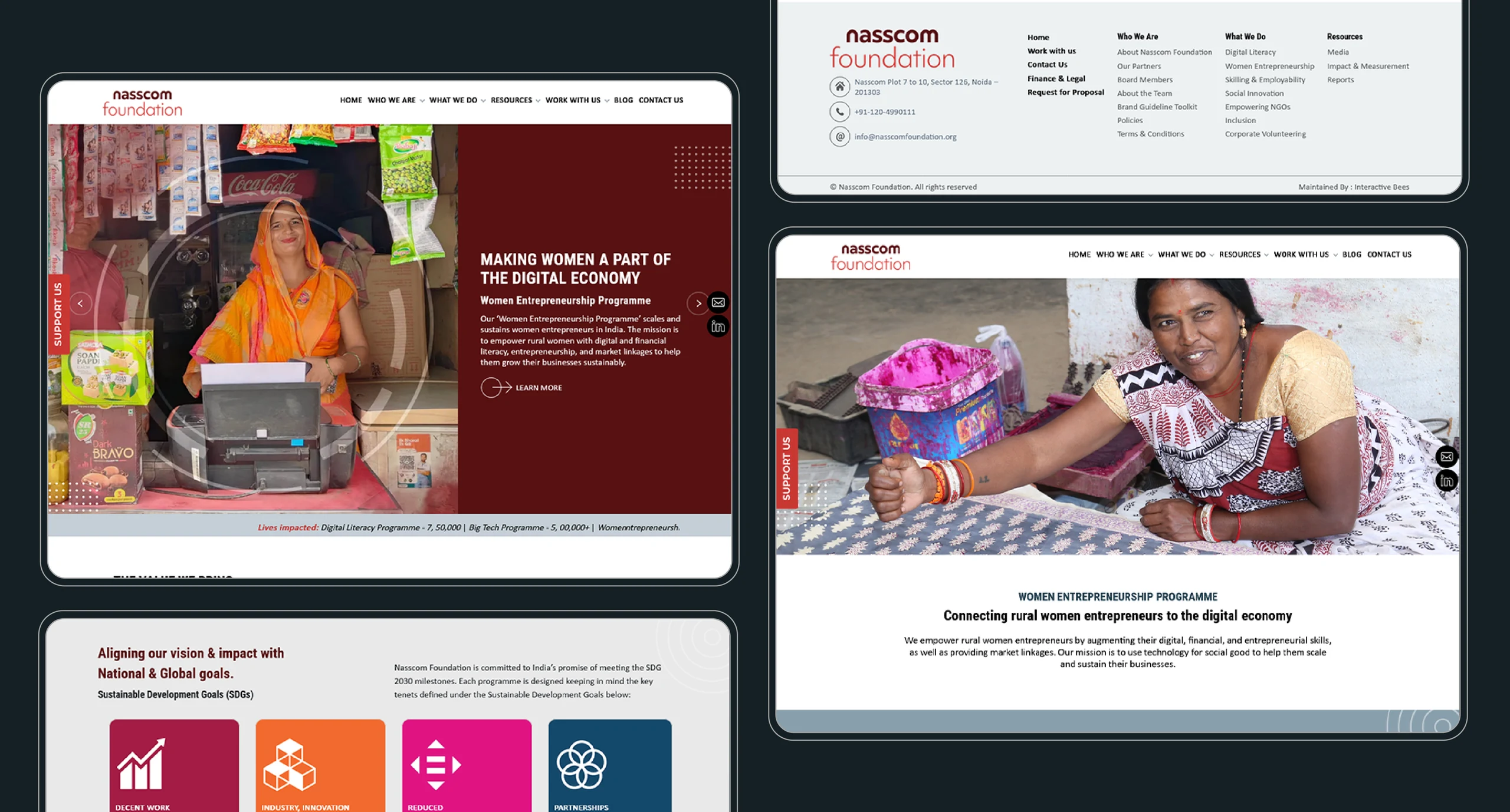
NASSCOM Foundation digital-economy and women-entrepreneurship programme website compositions
Programme detail / Different areas of work within one visual language.

03 / The mobile experience

Adapt the layout.
Retain the purpose.

Mobile and tablet compositions reflow the content around a smaller screen. These are design presentations, not a claim about a currently live website.

NASSCOM Foundation mobile layouts showing programme areas, participant stories and organisational information
The mobile experience / The same design language in a vertical format.
NASSCOM Foundation team, skilling and social-innovation website compositions across desktop, tablet and mobile
Across devices / Programme and organisation content in connected layouts.

A wide range of work.
One connected website.

Website layouts that give programmes, people and participation a clear place in the story.
Explore more website work
Build with Us / ENG1N

Bring it
to the crew.

A little context is all we need to start.

What brings you here? *
How your enquiry is handled

We save the details you submit in our private website backend, send them to HubSpot as a contact and enquiry note, and send an email notification to karan@eng1n.in. We use them to review and respond to your enquiry. This form does not subscribe you to marketing emails.

A secure session helps protect the form. A short-lived, hashed network identifier is used to limit repeated submissions. If HubSpot is temporarily unavailable, your enquiry stays saved for follow-up and sync.

Please do not include passwords or sensitive personal information. For questions about your submitted details, contact vroom@eng1n.in.

No mailing-list sign-up.
Just a conversation about your enquiry.