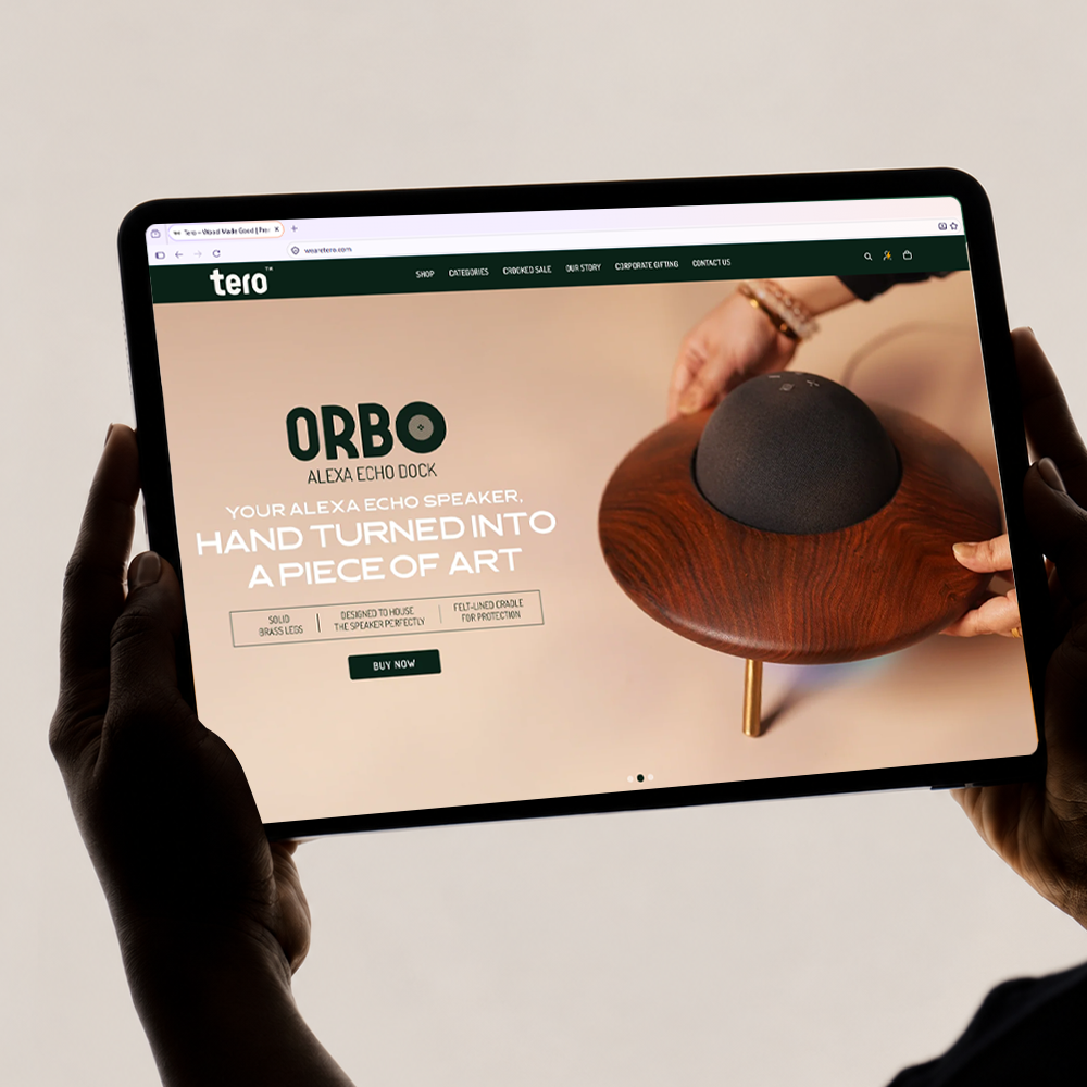
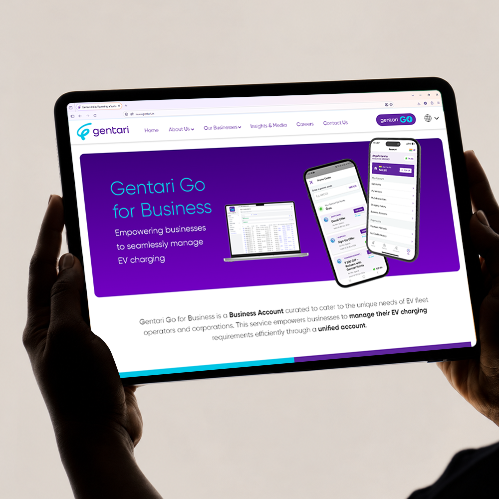
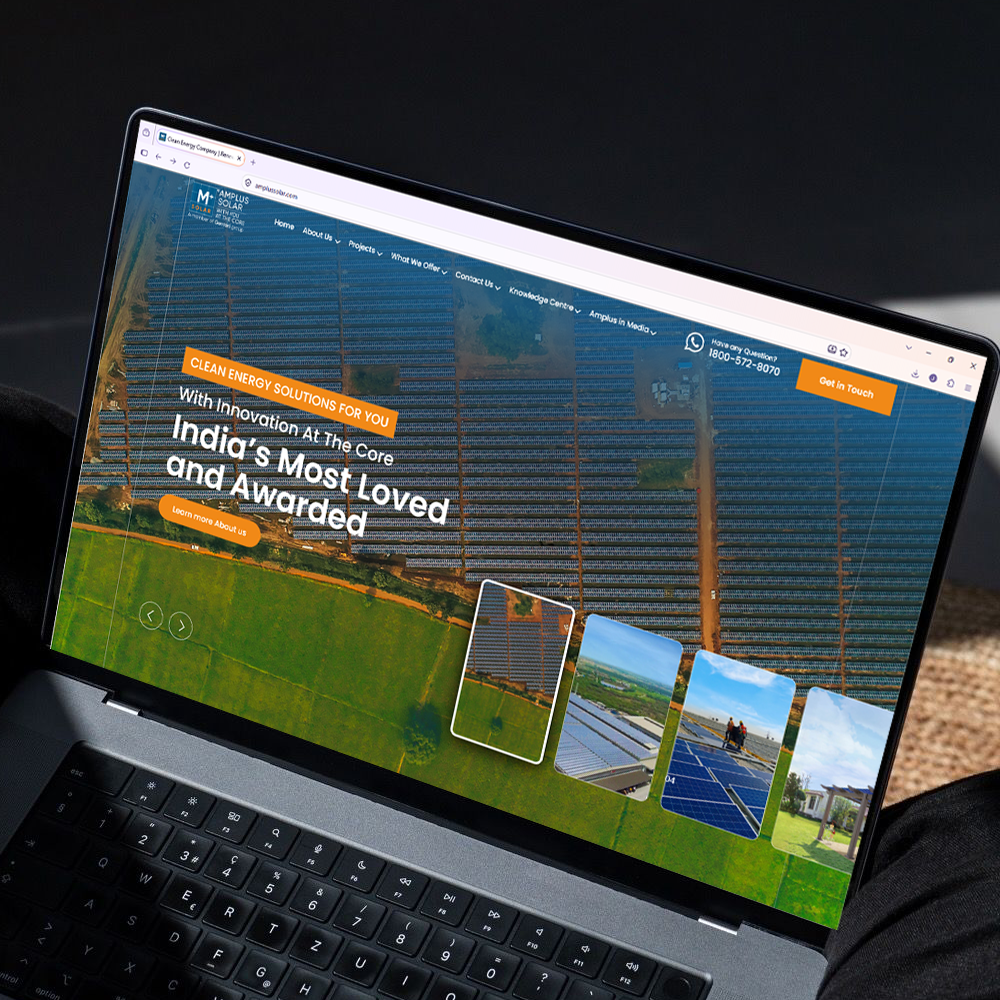
Website design / Case study
← All website case studiesZetta Farms / Website design
A clearer view.
Of organised farming.
Farm projects, agricultural practices and the people behind them, brought into one connected website. A clear route from the wider proposition to the detail.
CONNECTED.↓Explore the website
01 / The challenge
More than
a field of green.
Farm projects, agricultural practices and partner enquiries need different kinds of detail. The design brings them together while keeping the wider Zetta Farms story in view.
The thinking
Show the farms.
Explain the approach.
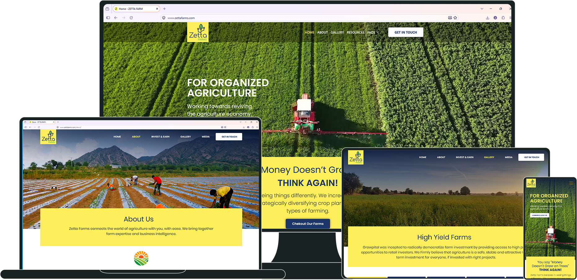
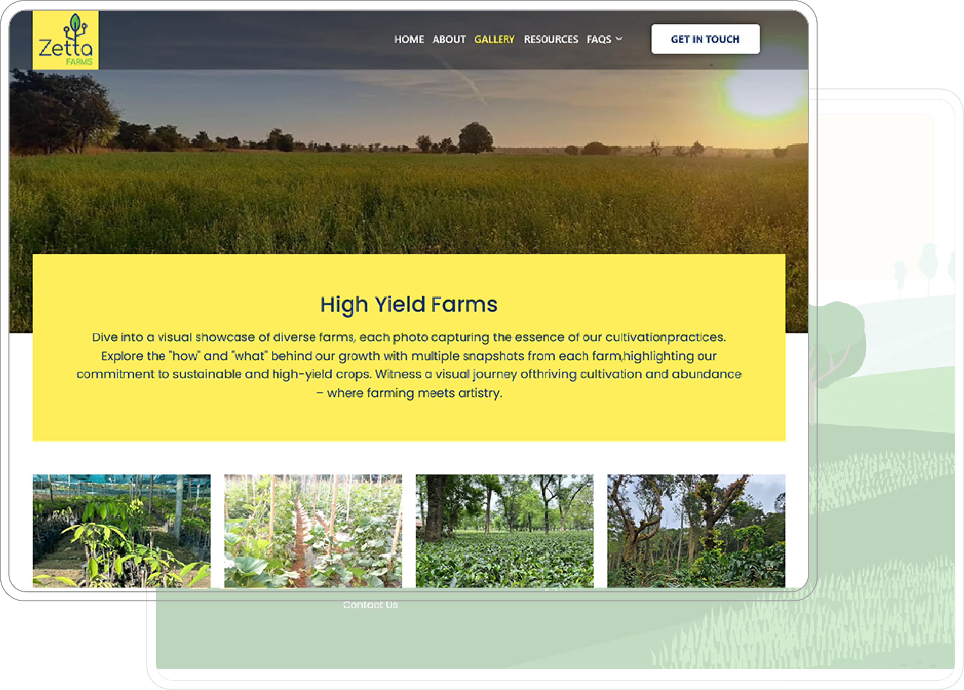
Field photography gives the story a real-world setting. A clear content hierarchy connects that first impression with the project information and farming practices.
Bold yellow panels, deep blue details and open layouts create a consistent visual language across the site.
02 / The website
The land.
The approach.
The next step.
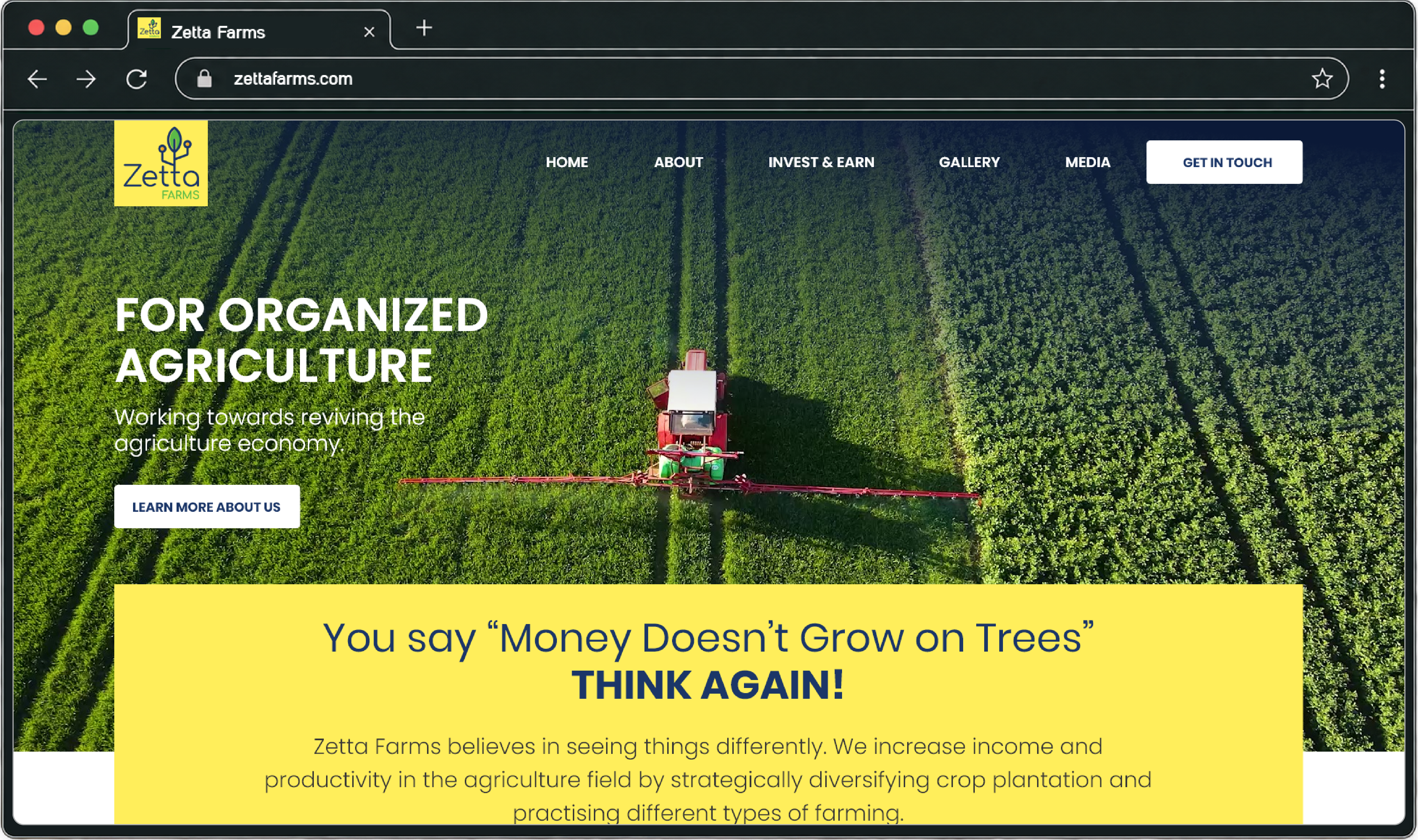
The experience moves from the opening proposition into farm projects, practices and ways to get in touch. Photography and focused information panels give each part of the story its own space.
From the story
to the specifics.
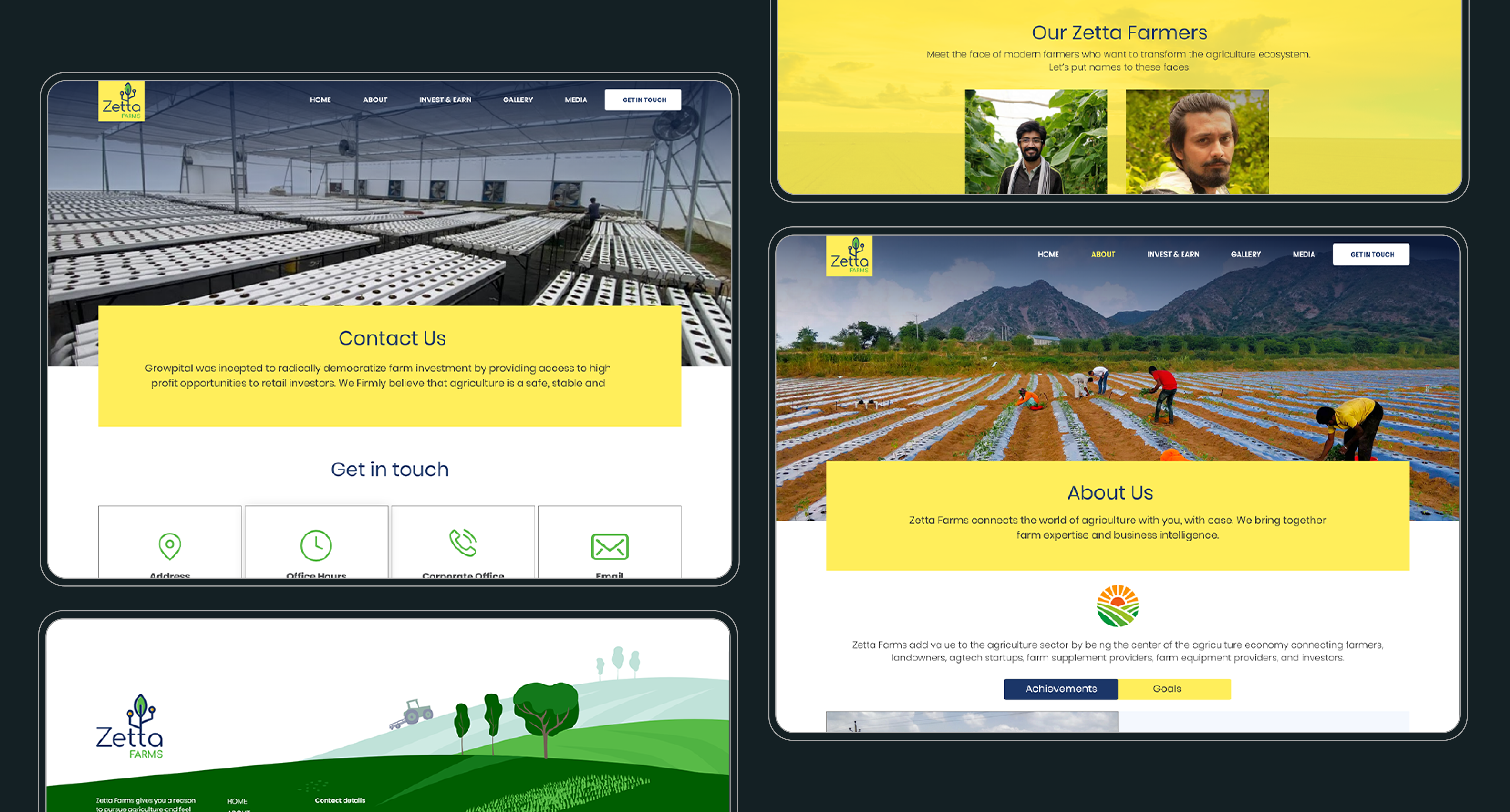
Company context, farm imagery and project information form a connected path through the website.
Let the land
set the scene.
Field photography and the yellow-and-blue palette give the content a recognisable setting.
Make it clear
where to go.
Distinct enquiry routes and contact details sit alongside the information visitors are exploring.

03 / The mobile experience
The same story.
Closer to hand.
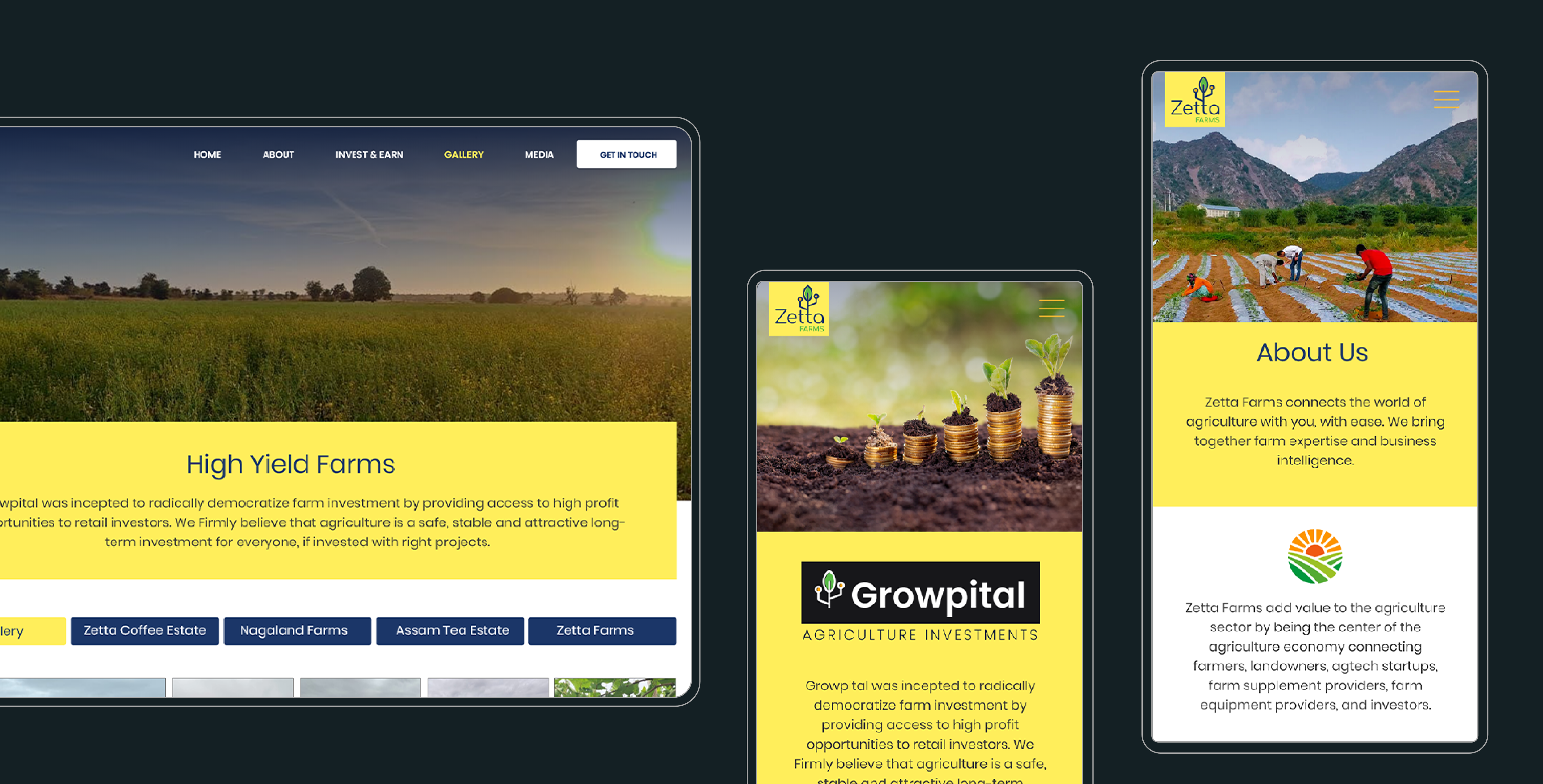
The layouts carry the farm imagery, company introduction and supporting content into smaller screens. A consistent hierarchy keeps the experience connected across desktop, tablet and mobile.

A bigger farming story.
A clearer digital home.
A website design that brings the land, the people and the detail into one considered experience.